Logo Investigation
Logo Investigation:
Dreamworks:
In 1994, director Steven Spielberg, Disney director Jeffrey Katzenberg and music producer David Geffen decided to create a new film studio that's now known as DreamWorks.
The original idea was slightly different to the boy sitting on the moon. They were originally looking for a computer-generated image of a man fishing from the moon but visual effects artist Dennis Muren (who was working with Spielberg at the time) insisted on making the logo by hand. So they asked illustrator Robert Hunt to draw it, and he was called in to execute the final image on which the motion version was based. It took him three months to complete the final motion logo with the boy fishing from the moon.
Spielberg loved this version and decided to use it for his new company.
The boy on the moon is William Hunt, the son of the illustrator.
2009 Dreamworks Intro:
As opposed to a 2019 version:
Paramount Pictures:
Paramount Pictures pictures company was created in 1912 by Adolph Zuka, a film investor, and the Froman brothers. At the time, the studio went by another name: 'Famous Players Film Company'. The famous Paramount Pictures logo shows a majestic mountain peak covered in snow and surrounded by a ring of stars which was created by the illustrator William Hodkinson who based his work on the Ben Lomond mountain in Utah where he spent his childhood.
The original logo had 24 stars - one for every movie star that had a contract with the studio during this time. However, now there are only 22 stars and no one knows why.
The original logo (shown below) can be seen with all 24 stars:
Compared to the more recent version which only has 22 stars:
A progression of the Paramount Pictures logo over time:
2020 Version of the Paramount Pictures Intro:
Columbia Pictures:
This famous logo depicting a woman holding a torch, a symbol of America, was created in 1924 and showed a lady draped in a US flag and holding a torch. There were no clouds in the background and the forehead of the woman was covered in a headdress and looked very primitive and the whole picture looked more like a sketch.
Original Logo:
Six years later the logo was improved. The lady became more elegant as she coiffed her hair and lost the headdress and the flag was now barely seen. The font was different as the letters had been enlarged and the writing was behind the girl, but the most important thing was that the empty background was now filled with clouds and the torch was no longer flickering and blinking, but glowing smoothly instead.
Current Logo:
In the next few years, the logo was slightly altered and the word 'pictures' was added, but the now classic look of the logo was created in 1993. After Columbia Pictures was bought by Sony, the logo was repainted and digitally repainted by New Orleans artist Michael Dias who hired Jenny Joseph as a model for the logo. Dias decided that the flame shouldn't be so bright and that the logo should mainly focus on the girl. Therefore she was redrawn more elegant and tender than ever before.
Finally in 1996, the animation was changed. First you could see the torch and then the rest of the picture. Also, during the opening you can hear a tune written by Jonathan Elias.
Current Columbia Pictures Intro:
Metro Goldwyn Mayer:
In 1924, American lyricist Howard Diaz created a logo for the Goldwyn pictures depicting Leo the Lion roaring. Over the years, at least seven lions interpreted Leo the Lion. However, the one we still see on the logo is Leo.
The original logo was noiseless, so the lion was only there for decoration. In each cinema, a phonograph was placed behind the screens to reproduce the sound during the opening.
One of the first versions of the logo:
One of the most recent versions:
Walt Disney Company:
Just like many other companies, Walt Disney Company was founded by two brothers, Walt and Roy Disney, in 1932.
As the Disney company and logo became more and more widely recognised, and what was originally a small motion picture studio became one of the biggest Hollywood studios ever.
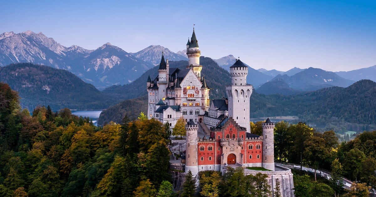
What many people don't know is the castle depicted in the logo is actually the Neuschwanstein Castle, or New Swanston Castle, and is a 19th century Romanesque revival palace in the southwest of Germany.
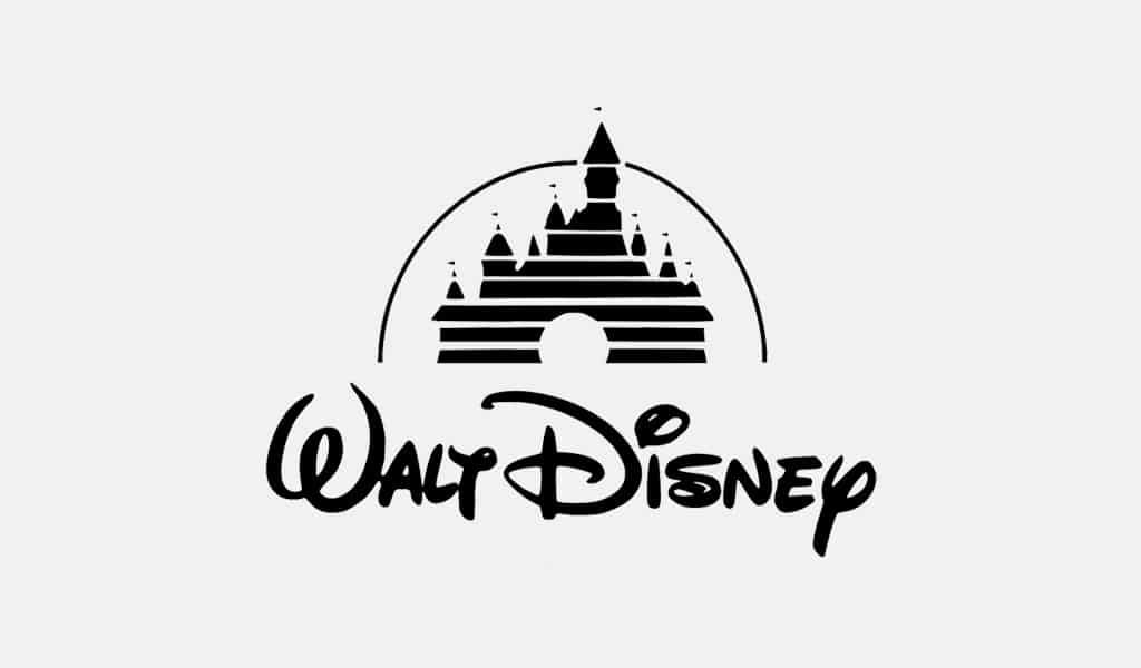
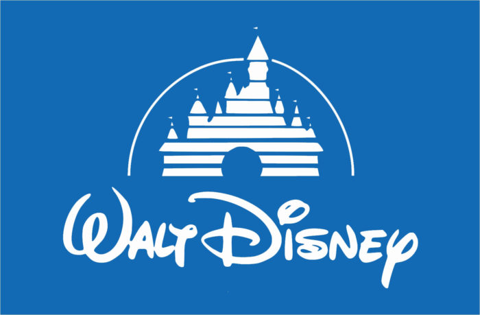
Original Logo:
Current Logo:
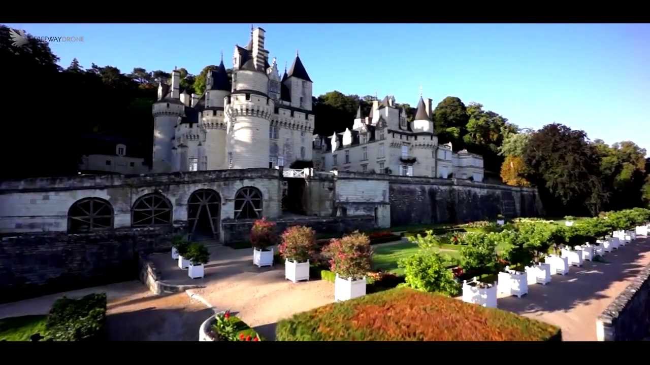
The original logo was used up until 2006, where they replaced it with a totally new 3D computer-generated logo created by the Wetter Digital Studio, which used the Château d'Ussé Castle (or the Cinderella Castle) as a prototype.
Original Intro:
Updated Intro:
CBC Studios:
Original Logo:
Updated Logo:
The use of the dark green has been purposefully done. In both preliminary tasks and our foundation portfolio, they have all been set outside with in a natural setting. Greenery is evident in our openings, so for the final version we decided to keep that theme ongoing. Our foundation portfolio is set directly in the middle of a forest to add to the mystery and suspense of the opening.
*Since Chloe is absent, I am unable to put the updated version of the logo since the editing and processing of it has been done on her computer.*


Overall Score: 18/20
ReplyDeleteWell done in some extensive Logo research. Please just include your images of your group logo, too.